津波|高台へ避難 MFA Thesis · Graphic Design · Liberty University

Semiotic Breakdown

in Disaster Evacuation Signage for International Tourists

Cross-cultural visual communication failure in Japanese coastal cities, and a redesigned signage system for the Kamakura evacuation corridor.

Read the thesis
Chapter 3 · The Existing System

A system designed for an audience
that has changed

Japan’s disaster evacuation signage systems are highly standardized and widely regarded as effective for the domestic population, who operate within a shared cultural framework shaped by years of earthquake drills, formal disaster education, and a common visual vocabulary for risk and evacuation. In coastal cities like Kamakura, however, the audience composition has changed significantly, with millions of international visitors now navigating these spaces each year without the disaster literacy or cultural familiarity that the existing signage was designed to assume.

When those shared assumptions about urgency, symbolism, and environmental threat are absent, the communicative force of the system can be significantly diminished, and signage that was intended to signal immediate danger may instead read as informational, decorative, or peripheral within a leisure-oriented environment. This thesis investigates that gap as a problem of cross-cultural visual communication rather than one of regulatory standards or local government compliance, examining Kamakura’s evacuation signage as a semiotic system whose effectiveness depends on shared meaning between designer and viewer.

Chapter 1

The origin of the research

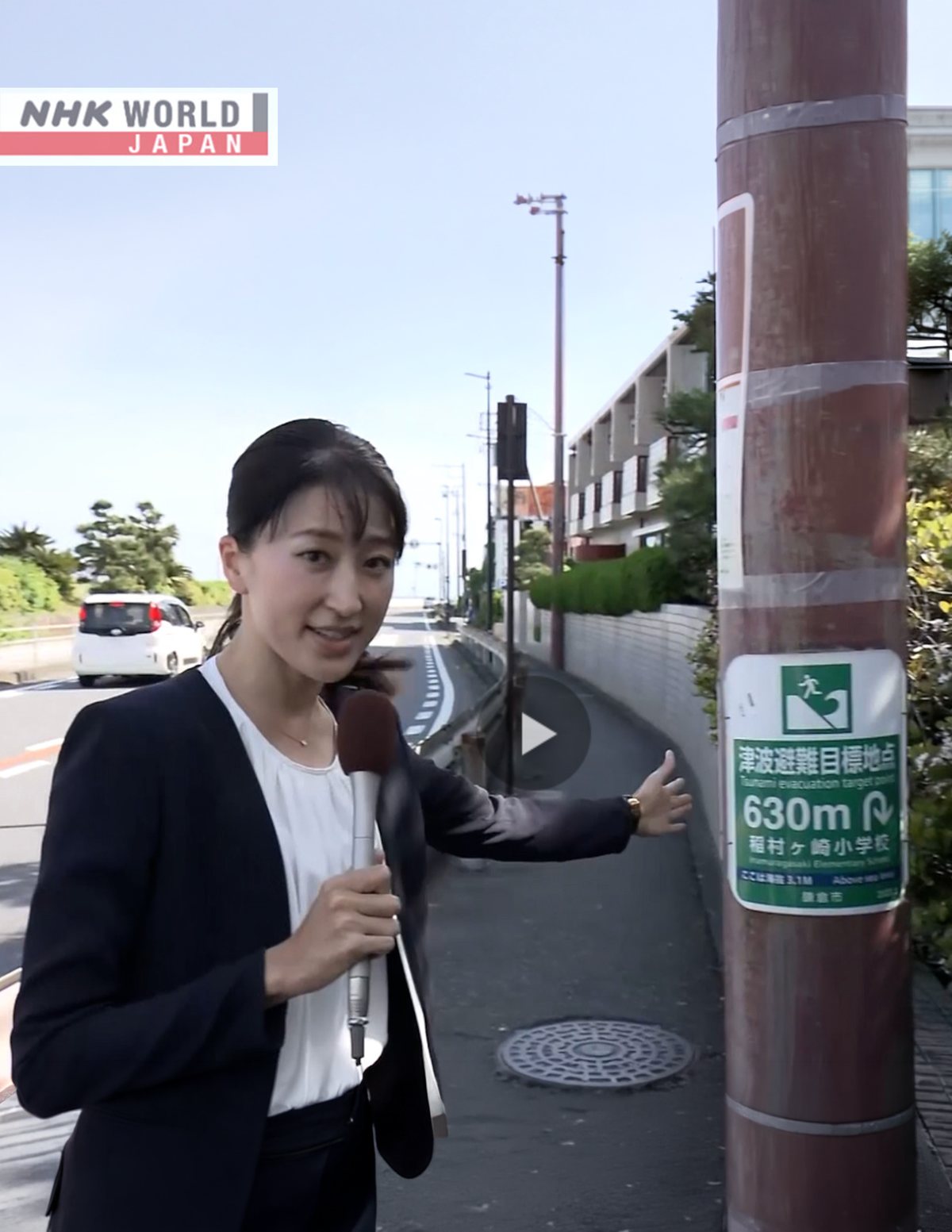
The origin of this thesis was an NHK news report in which reporter Sato Mariko walked one of Kamakura’s designated tsunami evacuation routes on camera and tested how a tourist would actually experience the system. Several of the tourists she interviewed described how difficult it was to even notice the signs, and a number of them indicated they had not registered any tsunami risk at all, despite the presence of evacuation signage in the areas they had been walking through.

That report connected to a longstanding interest in how visual communication functions in high-stress environments, developed during my service as a geospatial intelligence analyst in the Marine Corps, where I produced map-based visual materials for commanders in the field. What was being described sounded like a breakdown in cross-cultural communication: a system designed for a domestic population before overtourism became a defining feature of the audience now moving through these spaces.

~20Mvisitors received by Kamakura annually, many without prior knowledge of Japanese disaster conventions
23peer-reviewed articles and foundational sources reviewed across five intersecting research domains
3comparative case studies: Thailand, New Zealand, and Kamakura, Japan
Page from the thesis documenting the NHK news report that originated the research
The NHK report that began the research: an on-camera walk of Kamakura’s designated tsunami evacuation route.
Chapter 2

Five domains, three signage systems

“The presence of signage and the comprehension of signage are demonstrably not the same thing, and the gap between them constitutes the design problem this research addresses.”

1

Disaster evacuation behavior

International tourists are a distinctly vulnerable population: they lack shelter knowledge and spatial familiarity, and institutional planning largely assumes they will follow social cues from residents, an assumption survey research contradicts.

2

Risk perception & affect

Following Slovic, risk evaluation is affective before it is analytical. A sign must not only be visible and legible; it must feel dangerous to compel action under stress. Comprehension alone does not produce behavior.

3

Linguistic landscape

Non-Japanese readers face structural exclusion from safety-critical information; monolingual signage and kanji-dependent pictograms reproduce the exclusion they were meant to overcome.

4

Cross-cultural pictograms

Empirical studies dismantle the assumption of universal pictograms: in one study, 52 of 54 expertly designed, ISO-validated icons failed an 85% comprehension threshold across two cultures.

5

Wayfinding & the built environment

Urban structure can reinforce or suppress the willingness to evacuate. In emergencies people default to familiar routes and prior spatial knowledge, precisely what tourists do not possess.

The framing

Taken together, these domains reposition evacuation signage from compliant infrastructure to a cross-cultural communication system, one currently failing a significant and growing portion of its audience.
Case studies & visual analysis

Thailand

Post-2004 evacuation signage along tourist coastlines: trilingual route signs mounted alongside tourist wayfinding, pairing hazard-zone and evacuation-direction messages at the same decision points.

New Zealand

A national tsunami signage program built on a consistent visual grammar (zone, route, safe location, safe building) where each sign advances a single connected narrative of escape.

Kamakura, Japan

The central case study. A regulatorily compliant municipal system documented in the field, and analyzed semiotically in Chapter 3 as the audience around it has changed.

Chapter 3

Walking the route a tourist would walk

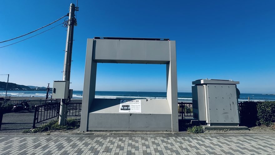
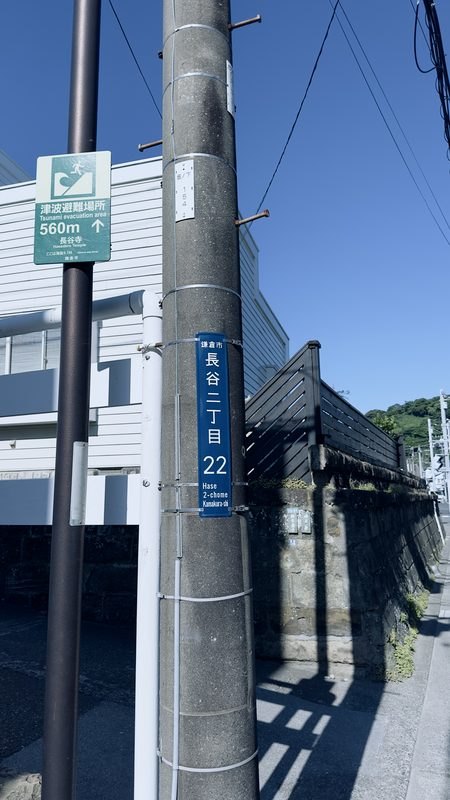
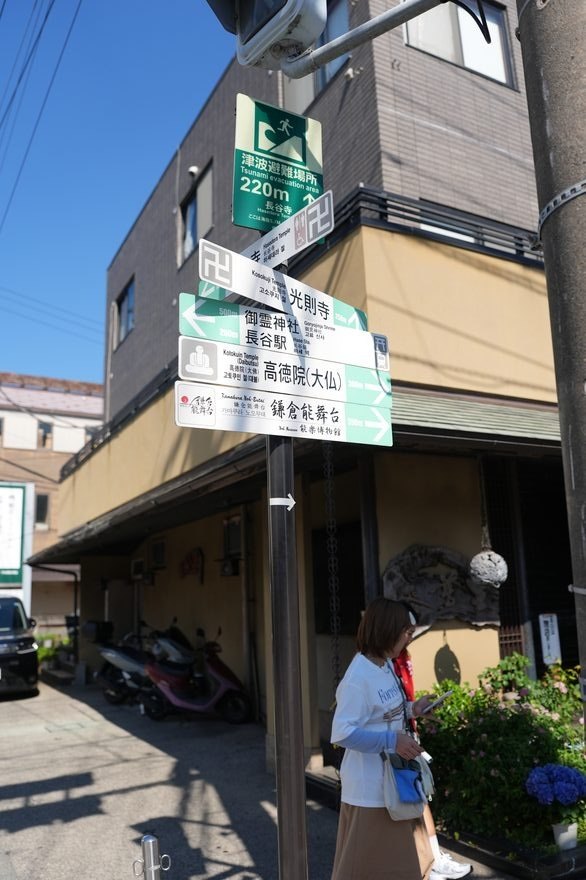
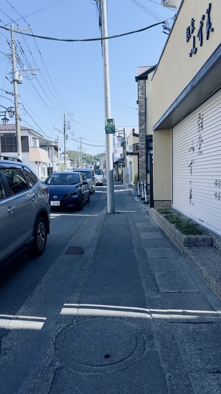
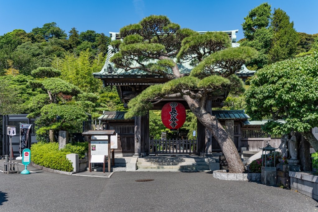
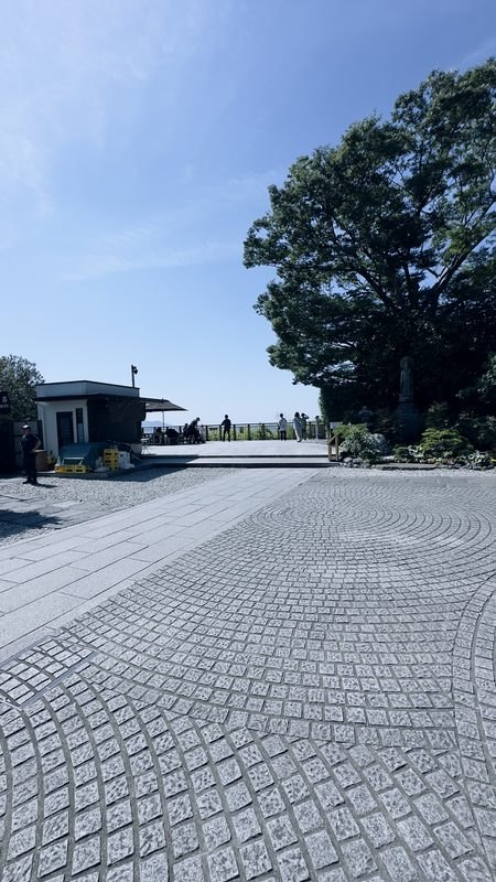
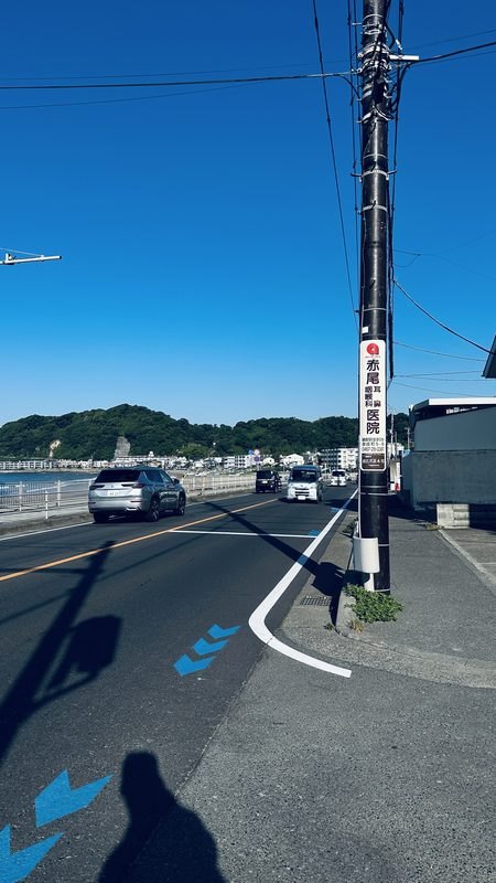
Field research followed the designated evacuation corridor from Yuigahama Beach to Hasedera Temple, documenting every sign an evacuee would encounter and applying the evaluation framework developed in this chapter. The photographs below are presented as they appear in the thesis.

“A tourist who has navigated an unfamiliar city in a panic state, following signs in an unreadable language, is left in continued uncertainty at precisely the moment the system should provide confirmation.”

Failure modes identified

  • Chromatic interference
  • Linguistic exclusion
  • Affective register deficit
  • Pictogram reference failure
  • Placement failure
  • Behavioral void
  • Route-continuity failure
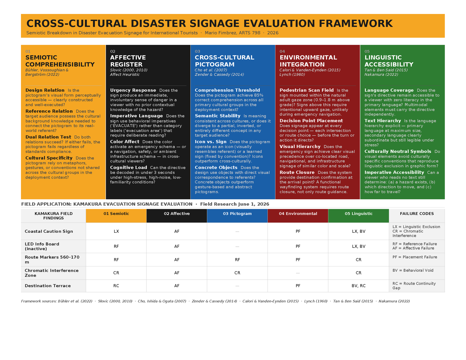
Cross-cultural disaster signage evaluation framework diagram
The cross-cultural disaster signage evaluation framework developed in Chapter 3 and applied to every artifact documented in the field.
Chapter 3 → 4

It began with the pictogram

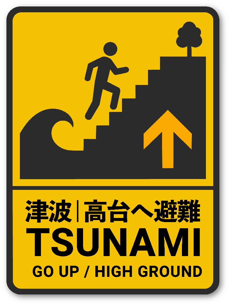
The pictogram had to do three jobs at once: identify the tsunami hazard, generate the urgency required to activate Slovic’s affect heuristic, and provide a behavioral directive legible across cultural and linguistic boundaries. In practice these requirements did not work together easily. A pictogram that felt “more dangerous” was not necessarily better at telling the viewer what to do.

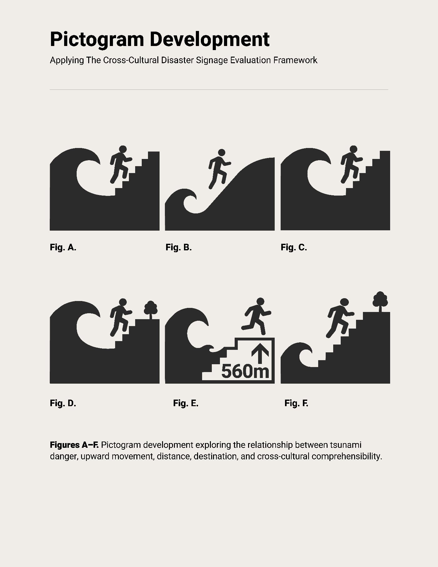
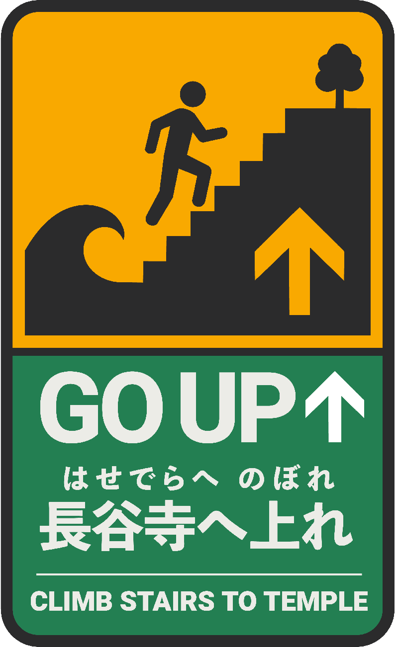
Early concepts tested larger waves for affective force, sloped inclines toward a distant tree, and explicit staircases. The final form keeps the wave subordinate to the action: a figure clearly ascending stairs, a directional arrow removing route ambiguity, and a small elevated tree using perspective to mark a destination meaningfully higher than the wave. Together they communicate not simply “move away,” but “climb upward to higher ground.”

Pictogram development concepts A through D from the thesis
Development concepts A–D: testing wave scale, incline abstraction, and stair explicitness against the affective and behavioral requirements.
The final replacement pictogram: figure ascending stairs away from a wave toward a tree, with an upward arrow

The revised pictogram

Stairs transform an ambiguous, near-horizontal escape gesture into a clear upward ascent. The arrow makes the directive explicit; the elevated tree implies higher ground as the objective.

Chapter 4

A dynamic color-state signage system
for the Kamakura corridor

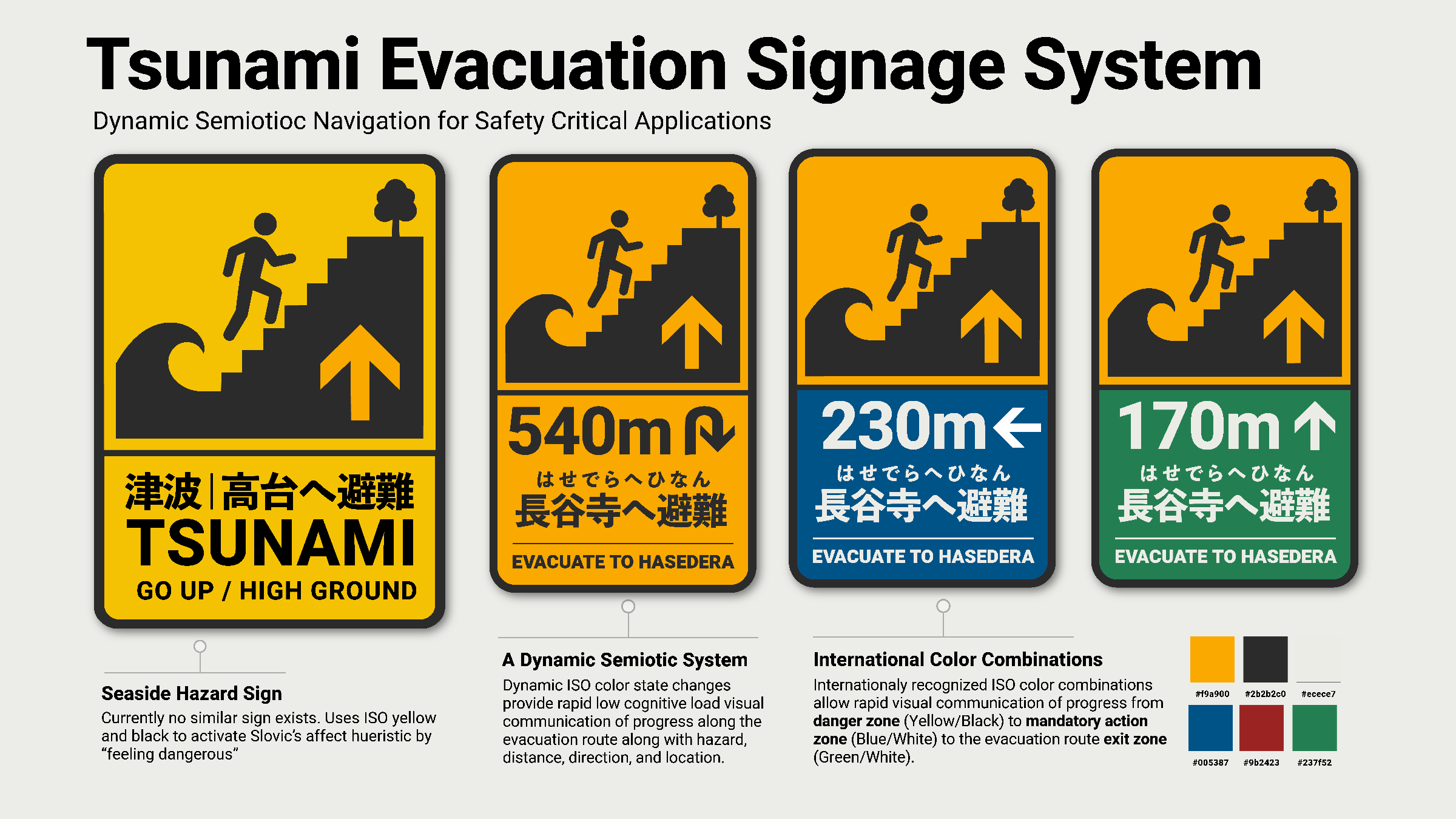
The system is dynamic not because individual signs change, but because their semiotic function develops as the evacuee moves through the physical environment. Distance, direction, color, and environmental position work together to communicate the evacuee’s changing relationship to the hazard, without requiring literacy in any single language.

Yellow / Black

Immediate danger at the coastline. ISO 3864 hazard pairing activates the affective response at the point of first contact.

Amber

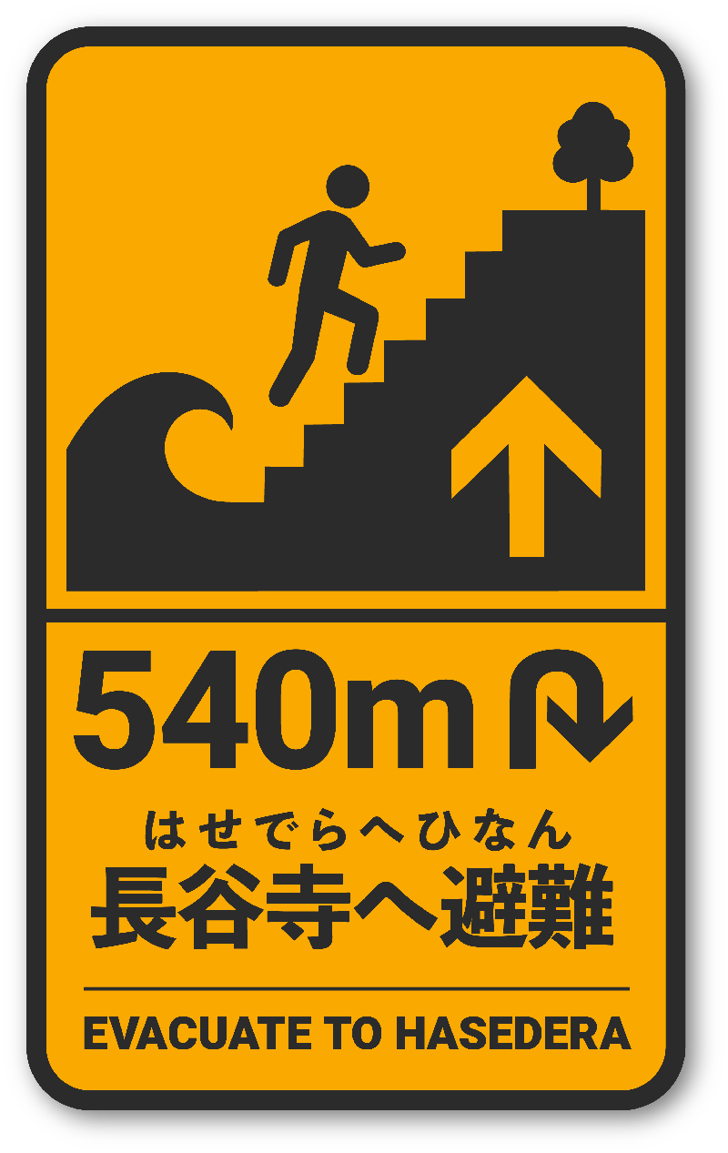
Warning sustained as evacuation begins: the 540 m route-entry marker keeps urgency high while movement inland starts.

Blue / White

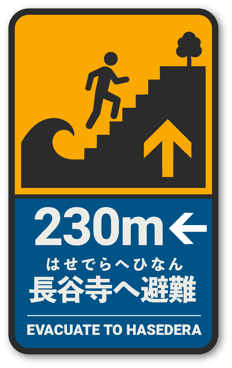
Mandatory action through the intermediate corridor: ISO’s mandatory-action register at the 230 m marker.

Green / White

The destination phase: entry into the final approach at 170 m, then confirmed arrival and ascent at Hasedera.

The full tsunami evacuation signage system: seaside hazard sign and three route markers in progressive ISO color states
The system at a glance: one custom pictogram, one formal architecture, progressive ISO color states from hazard to refuge.

The corridor, zone by zone: current condition vs. proposed intervention

01

Seaside Beach Zone

Yuigahama Beach, Kamakura

Proposed seaside hazard sign, yellow and black: TSUNAMI, GO UP / HIGH GROUND
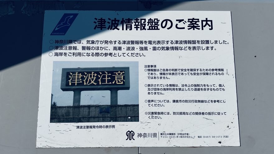
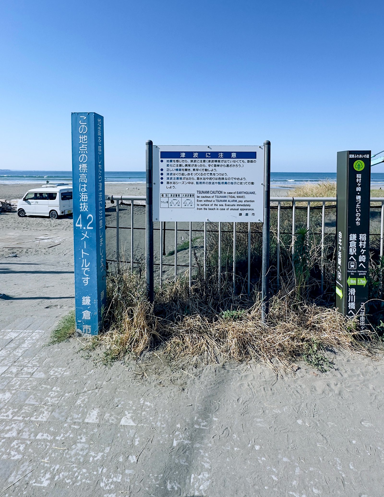
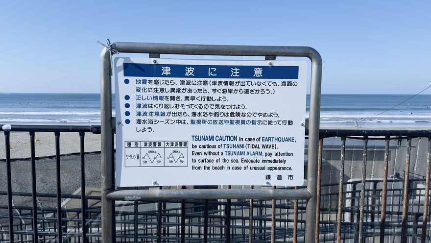
CurrentCurrent condition at Yuigahama Beach: text-heavy blue and white tsunami warning boards
No dedicated evacuation-direction sign exists on the beach. Text-heavy blue-and-white warning boards communicate risk but give no next action.
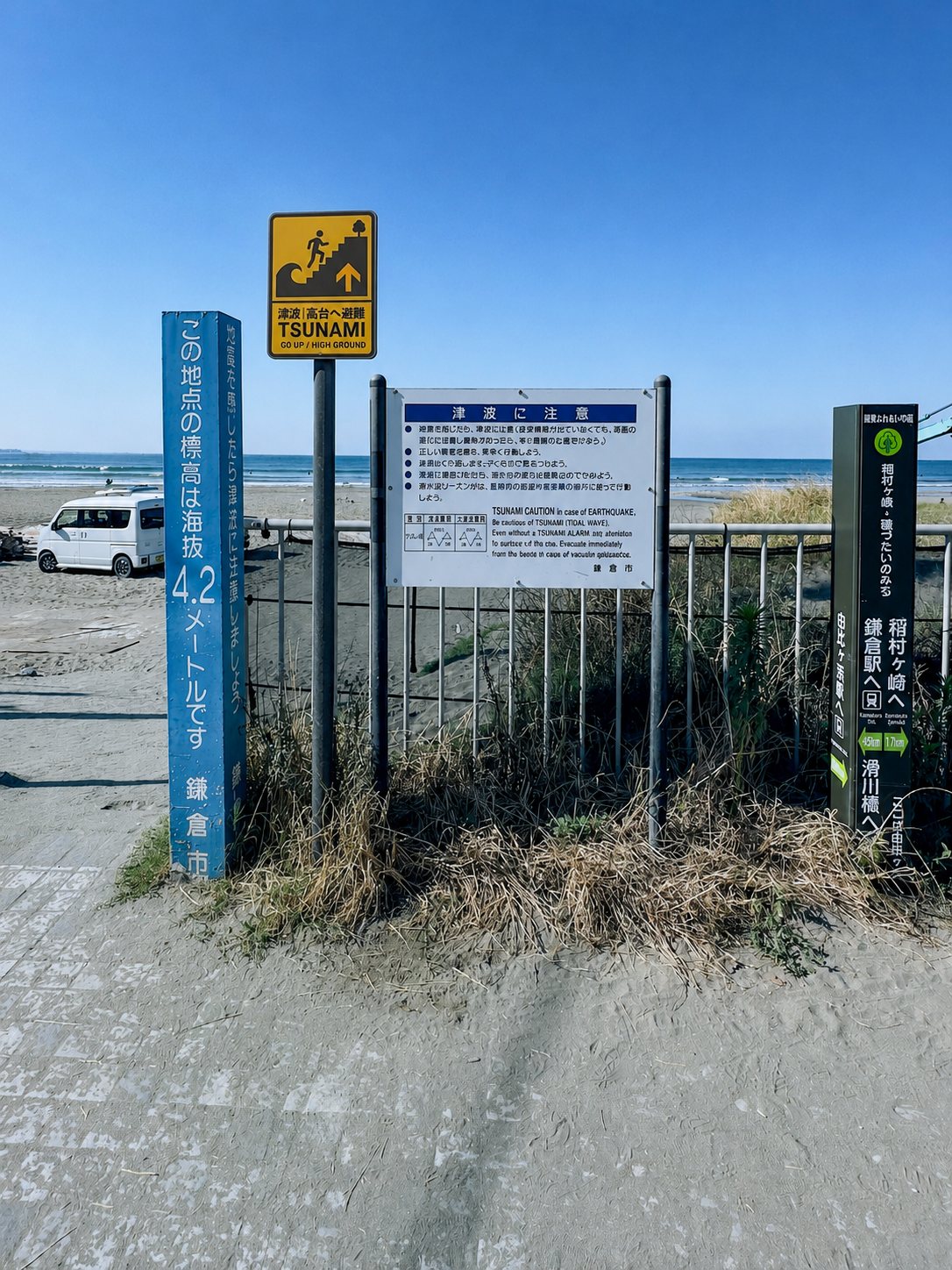
RedesignedProposed seaside hazard sign in place at Yuigahama Beach
Yellow-and-black raises salience at the point of highest danger; pictogram, arrow, and “GO UP / HIGH GROUND” supply the missing behavioral instruction.
02

Evacuation Route Entry · 540 m

Yuigahama Beach to Hasedera Temple

Proposed 540 meter amber route-entry marker: Evacuate to Hasedera
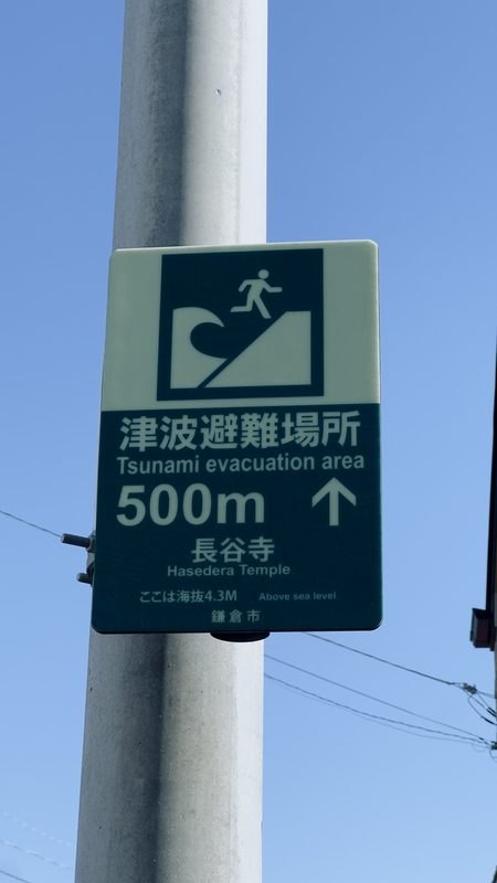
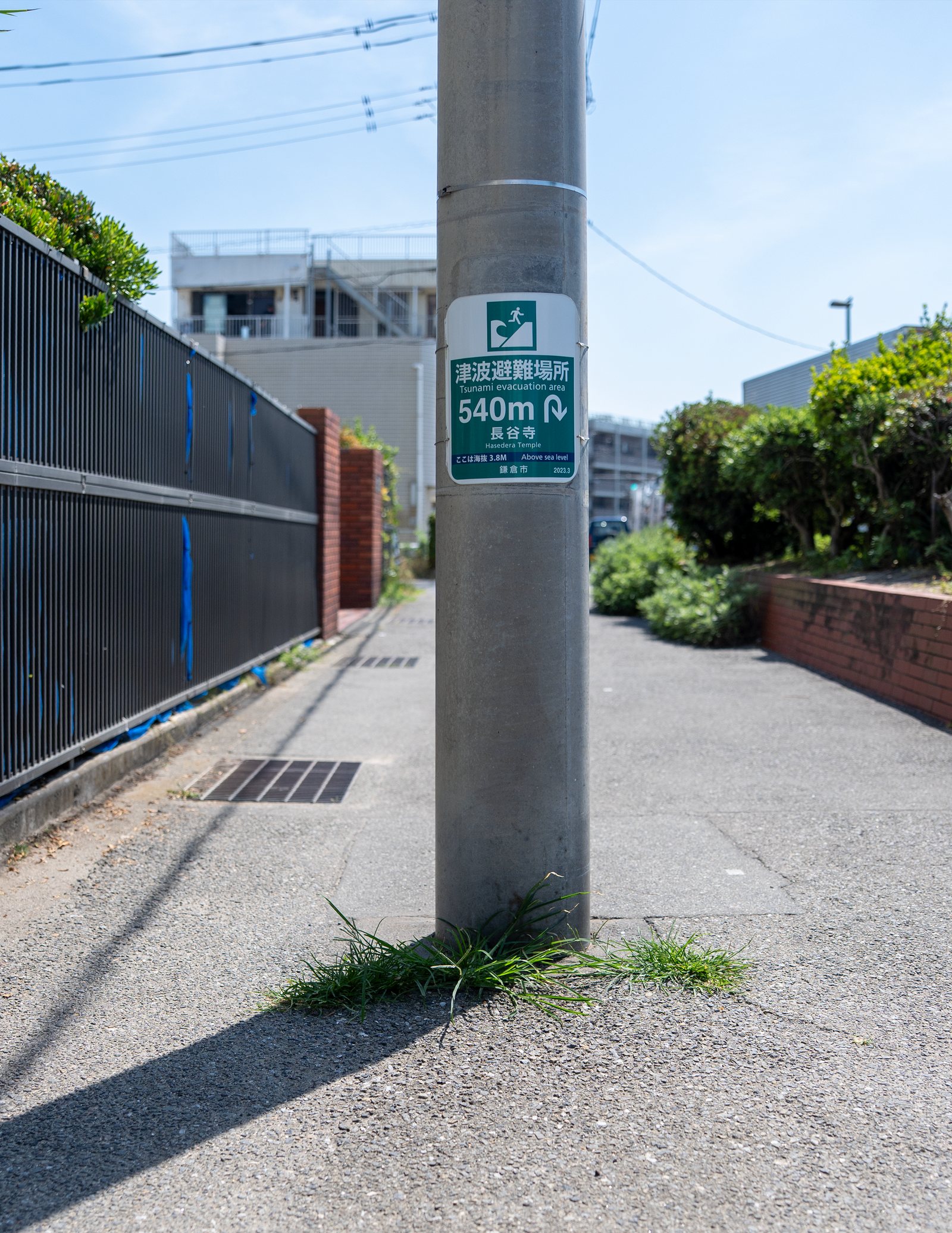
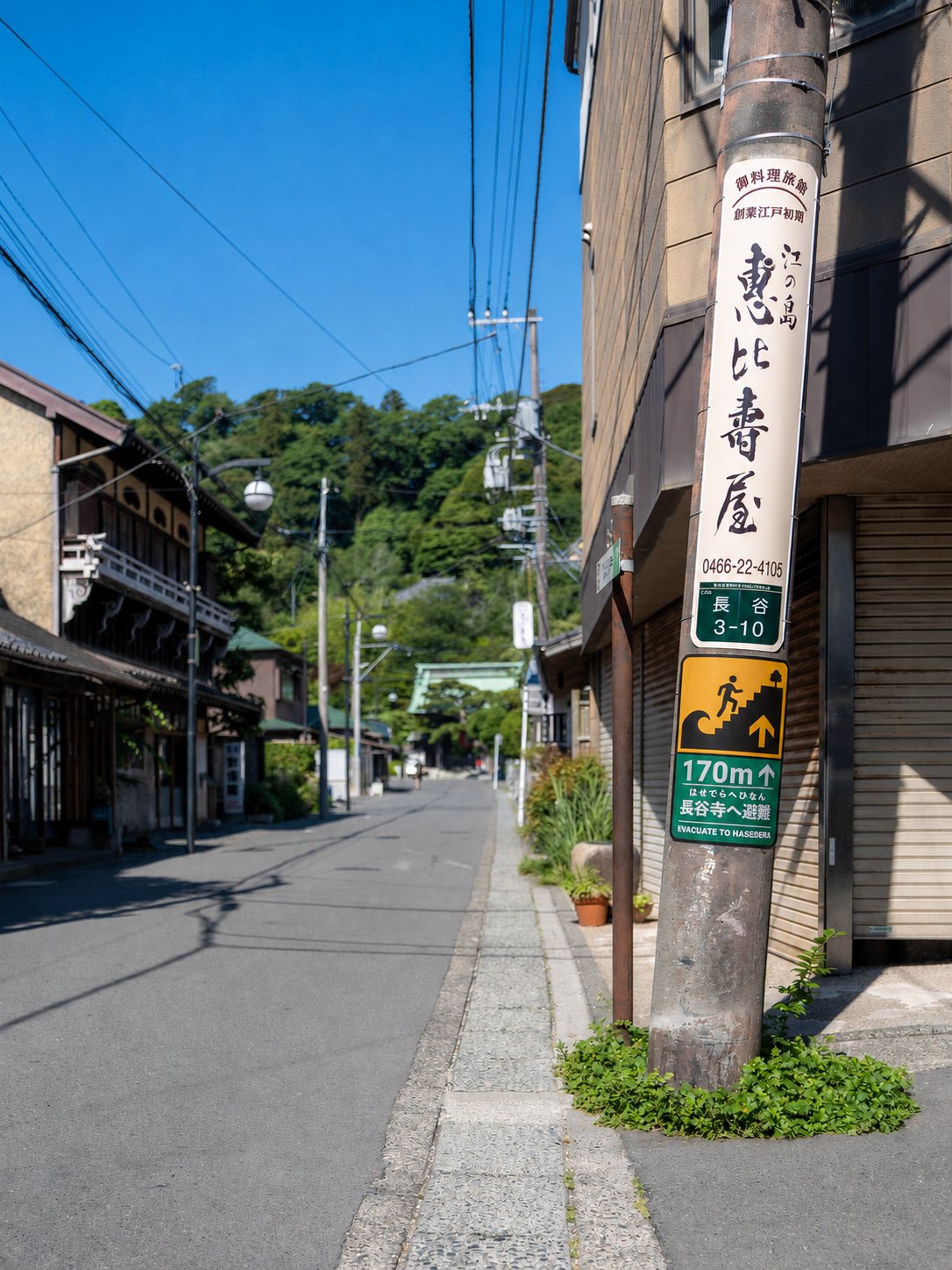
CurrentExisting green and white 540m marker on a utility pole
The existing green-and-white marker guides the evacuee while they are still in the highest danger condition: the calmest register at the most urgent moment.
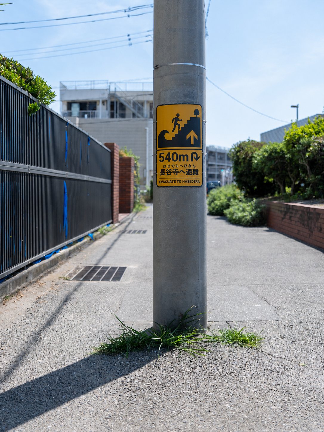
RedesignedProposed amber 540m route entry marker in place
Amber across the full surface signals urgency at the route’s point of entry, and it is the first sign to name Hasedera as the destination.
03

Mid-Route Evacuation Zone · 230 m

Intermediate corridor

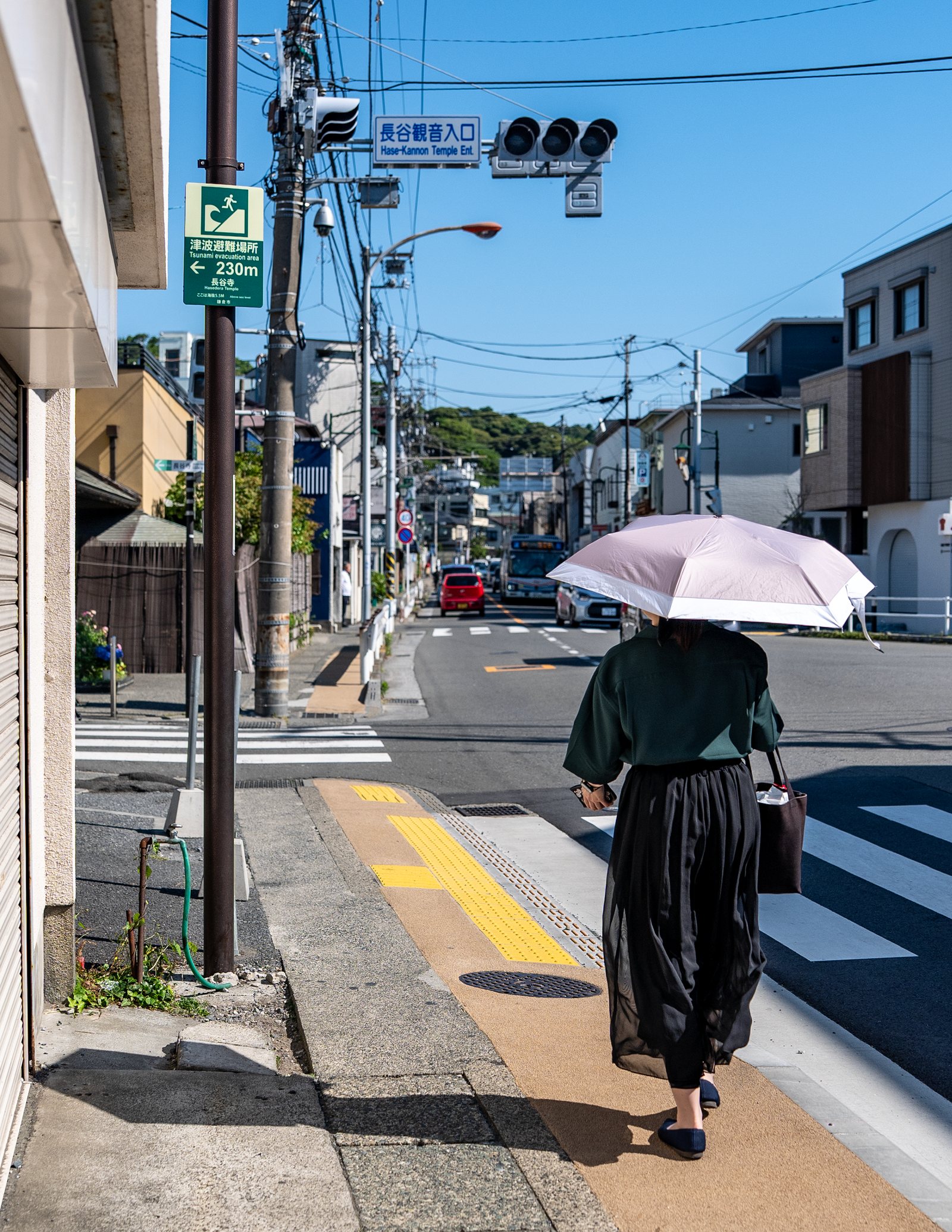
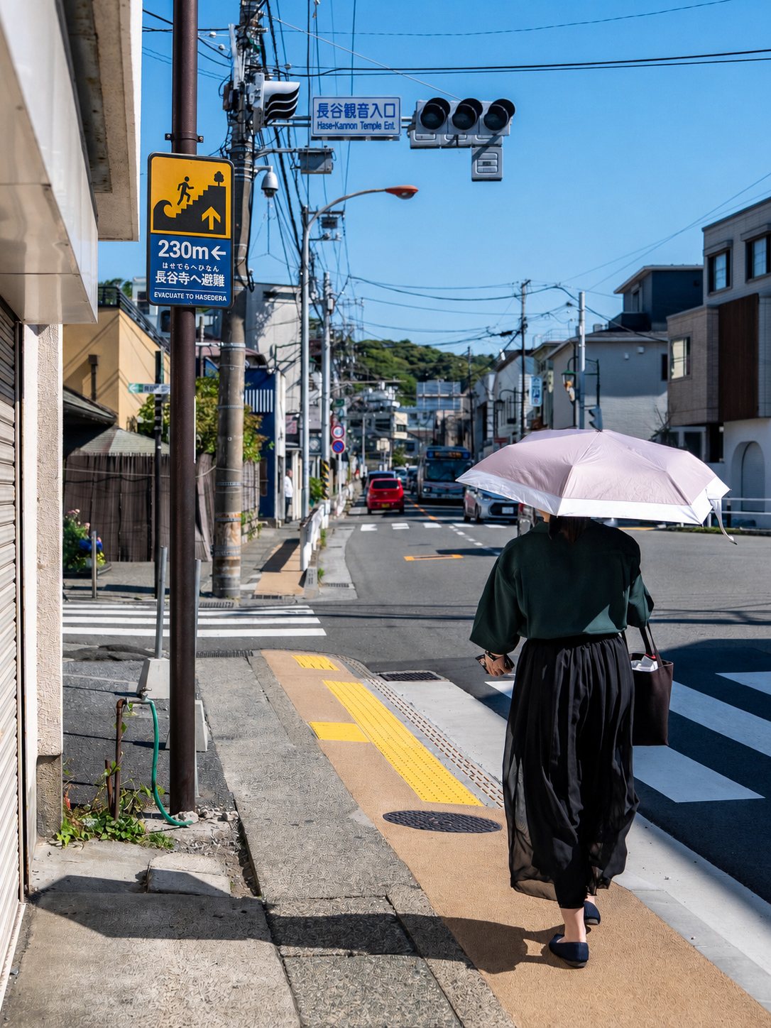
Proposed 230 meter blue mandatory-action marker
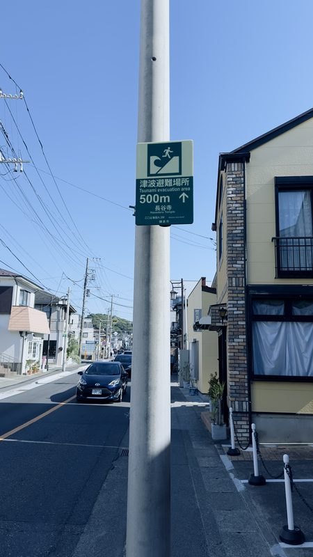
CurrentExisting mid-route marker among visually similar road signage
Uniform green-and-white treatment among road, utility, and tourism signage: no distinction between danger, required action, and approach to safety.
RedesignedProposed blue 230m marker in place
The shift to blue, ISO’s mandatory-action register, signals a new stage of evacuation while the shared architecture keeps the system recognizable.
04

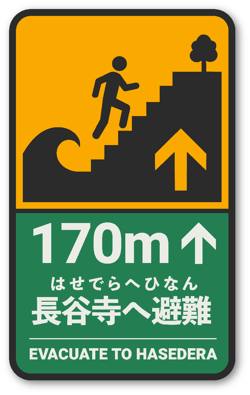
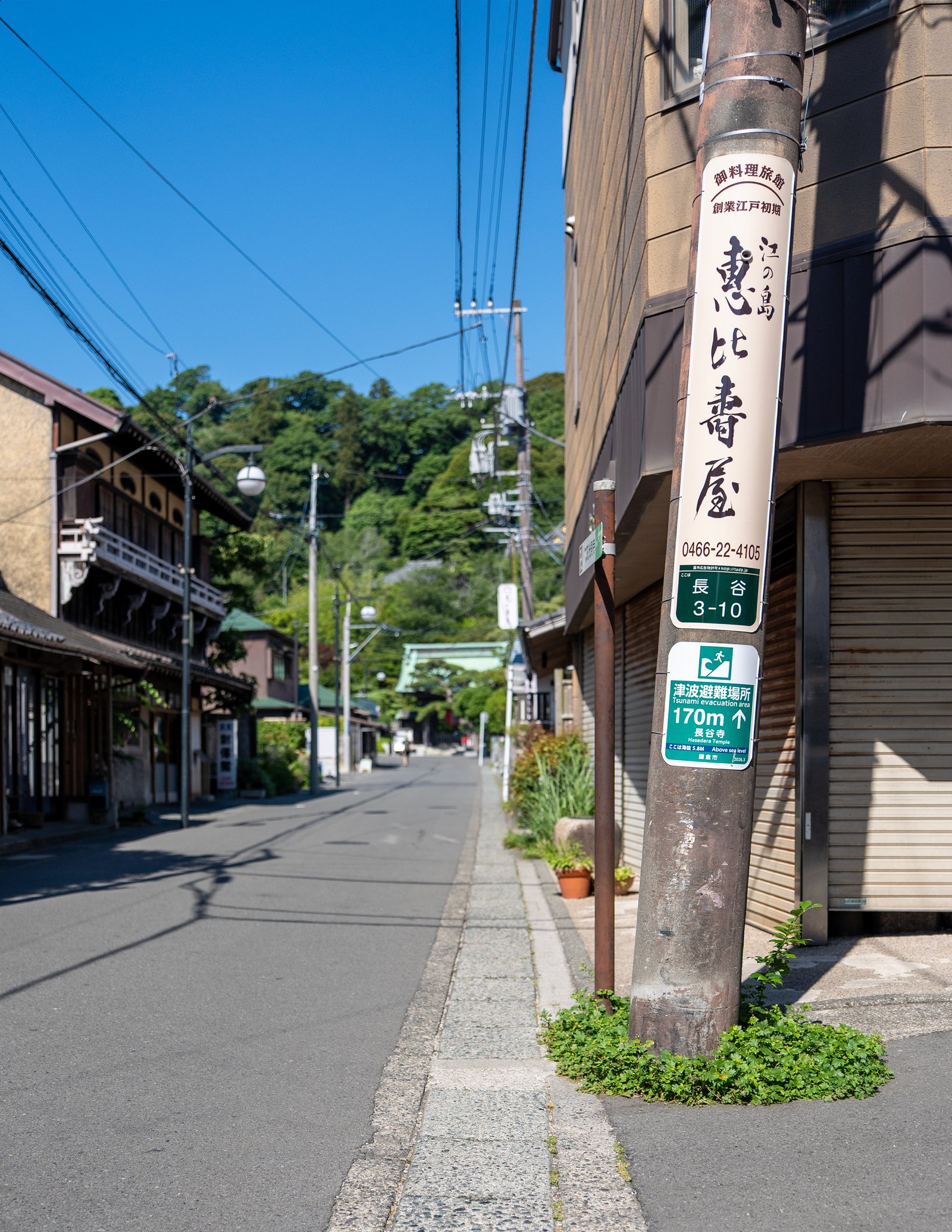
End-Route Evacuation Zone · 170 m

Final approach

Proposed 170 meter green end-route marker
CurrentExisting 170m marker, identical green throughout the corridor
Because the color never changes along the corridor, the current system cannot communicate progress or a changing relationship to the hazard.
RedesignedProposed green 170m marker in place
Green-and-white marks entry into the exit-to-safe-zone phase: progression within the same system, not a new sign requiring fresh interpretation.
05

Closing the Evacuation Sequence

Hasedera Temple

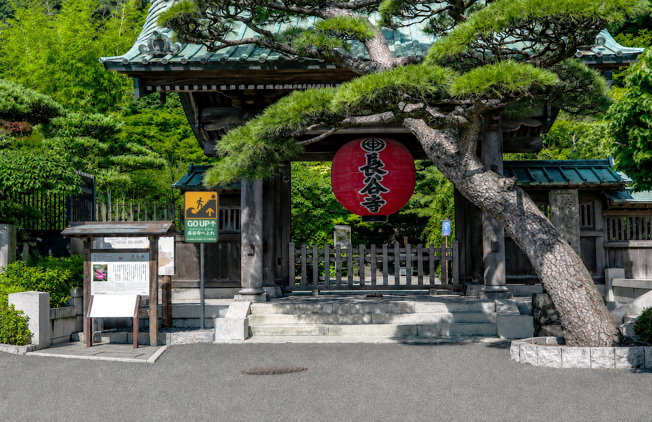
Proposed terminal green sign at Hasedera: destination reached, continue ascent
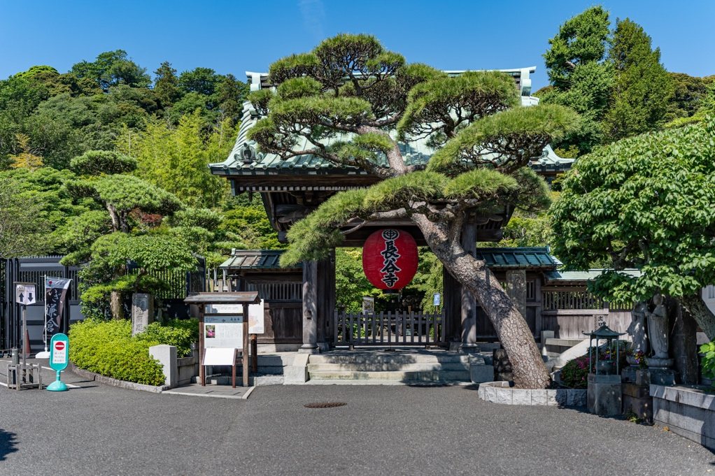
CurrentHasedera Temple entrance with no terminal evacuation signage
The existing route-marker sequence ends at the temple entrance with no confirmation of arrival and no directive to complete the ascent.
RedesignedProposed terminal sign in place at the Hasedera Temple entrance
The terminal sign establishes arrival at the destination zone and directs evacuees up the stairs, closing the loop opened by the seaside sign that first named Hasedera.
Chapter 5

A continuous semiotic experience,
not a collection of signs

Taken together, the seaside hazard sign, three distance-and-direction route markers, and terminal Hasedera sign address the corridor’s structural communication failures without displacing the system’s primary obligation to the domestic audience for whom it was originally designed. Japanese remains the primary detailed instructional layer at every stage, while concise English, distance, direction, progressive color-state changes, the repeated pictogram, and Gestalt continuity strengthen comprehension for international tourists, without creating a parallel English-first system that would compete with the original.

At the beginning of this thesis, I understood the problem primarily as one of sign visibility and cross-cultural comprehension. As the research and field analysis developed, I came to understand that improving individual signs would not be sufficient. An evacuation route functions as a continuous semiotic and behavioral system in which hazard recognition, urgency, direction, progress, arrival, and final protective action must remain connected.

The process also changed how I understood the role of visual communication in safety-critical contexts. A sign must do more than identify a hazard or transmit information. It must create sufficient urgency to persuade the viewer to act, make the required behavior explicit, and reduce uncertainty throughout the route.

This shifted the creative process from redesigning isolated artifacts toward designing a sequence of related communications operating within a specific physical environment, an approach this thesis offers as a model for cross-cultural evacuation signage design in over-touristed coastal cities.

Mario Christopher Fimbrez

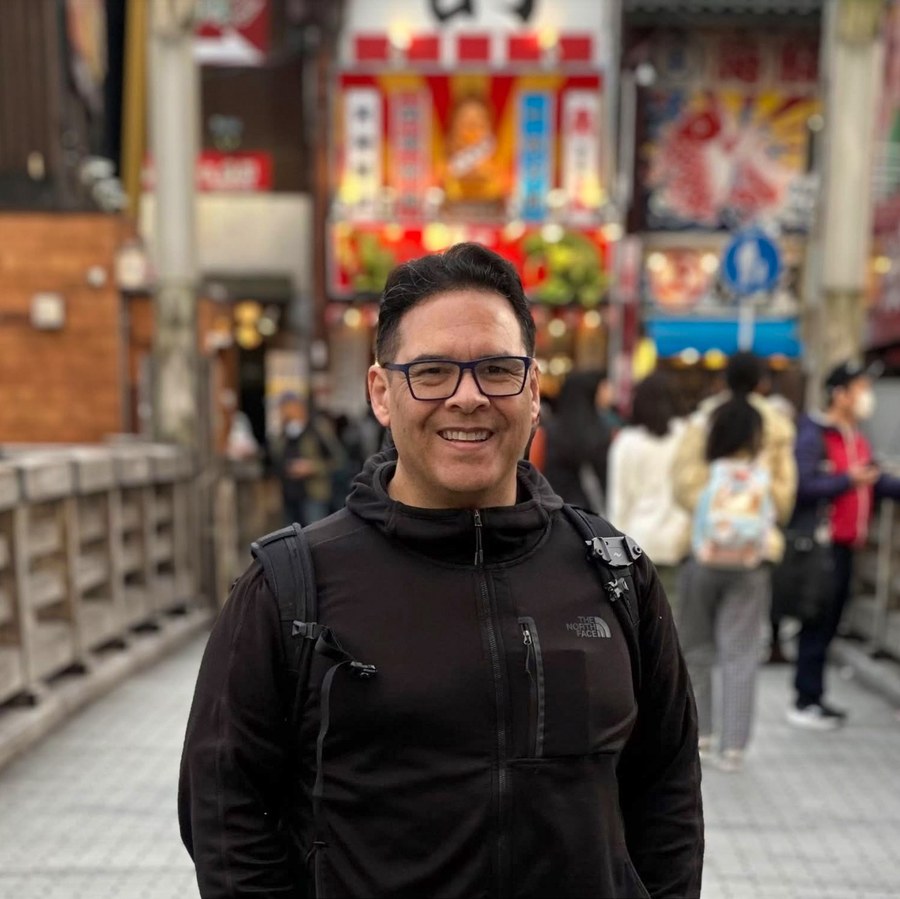
Portrait of Mario Christopher Fimbrez in Osaka, Japan

Mario Fimbrez is a graphic designer and MFA candidate in Graphic Design at Liberty University. His interest in how visual communication functions in high-stress environments developed during his service as a geospatial intelligence analyst in the United States Marine Corps, where he produced map-based visual materials for commanders in the field.

He maintains a working ability in Japanese and follows Japanese news sources, which is how an NHK report on Kamakura’s evacuation routes became the origin of this thesis. The field research documented in Chapters 3 and 4 was conducted on location in Kamakura, Japan.

Thesis for the Master of Fine Arts Degree in Graphic DesignLiberty University · August 2026

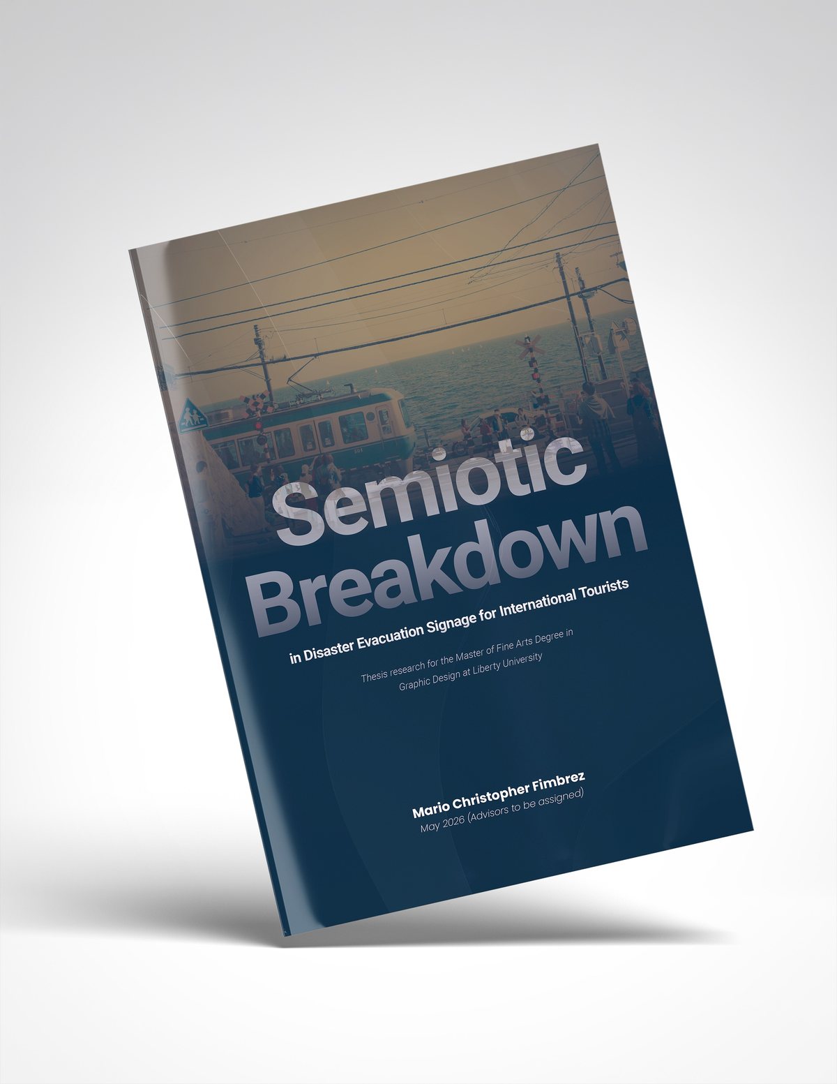
Mockup of the printed thesis document cover: Semiotic Breakdown
The thesis document.